Smiles For Miles Logo Mockup!
Prompt: A Pediatric Dentistry in the greater New York area looking for logo concepts. They want a fun icon or character to add to their name “Smiles for Miles.” It should be urban but inviting, memorable but soft.
Option 1
Option 2
The Process
Option 1
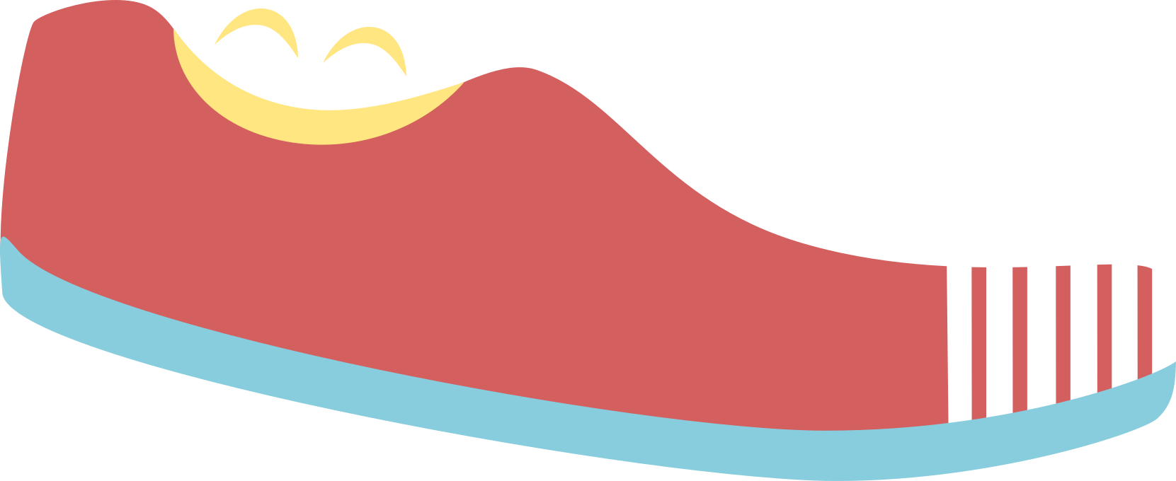
I incorporated the smile above the shoe, the toothbrush in the sole and toe of the shoe, and the shoe itself to play off “miles” in the name of the dentistry.
To make the toothbrush stand out more, I changed the color to be different than the rest of the mark, and took away the clutter of the border around the shoe.
Finally, I made the smile larger and blended it with the silhouette of the shoe so it would have more impact no matter what size the logo was scaled to.
After combining some of the listed elements,
two designs emerged.
Option 2
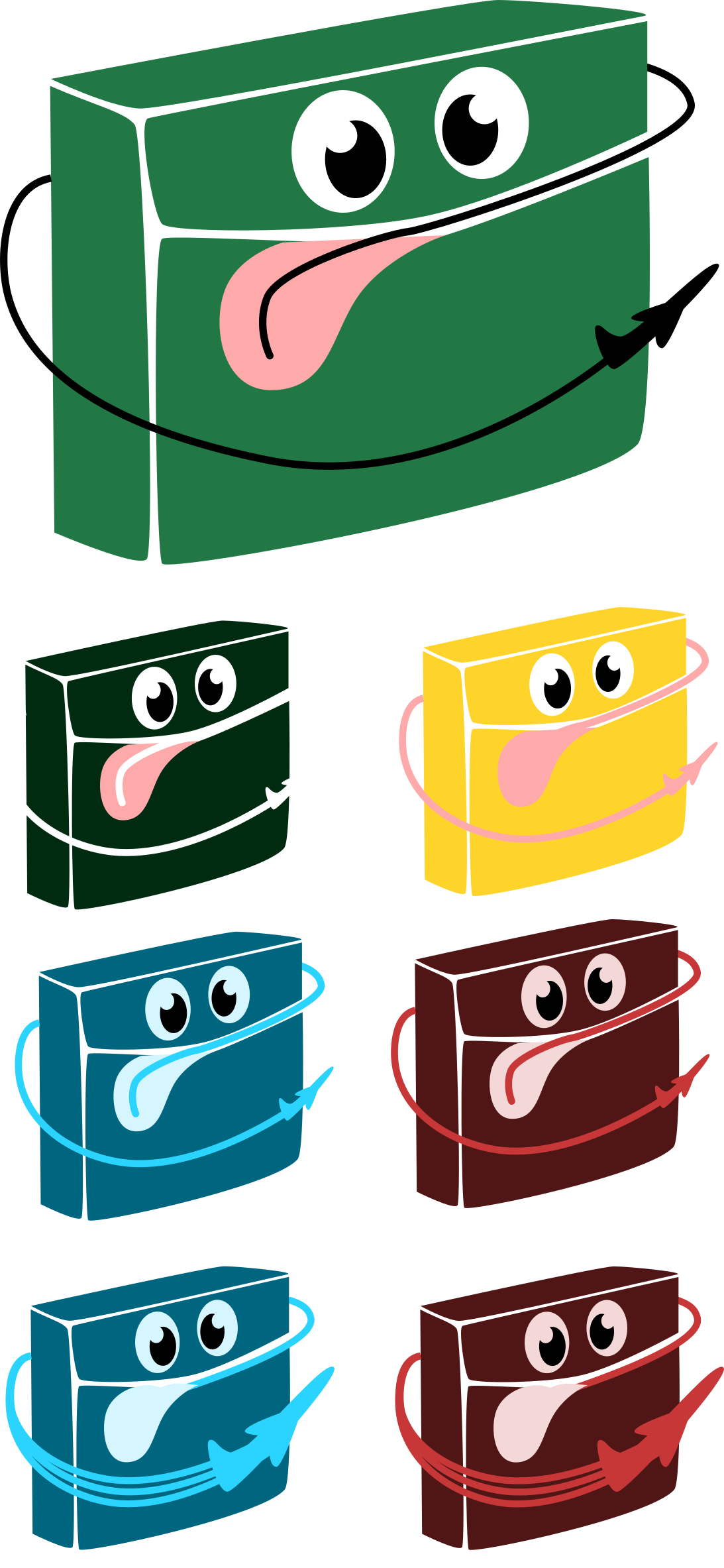
Leaning more into their request for a character, I came up with a happy floss dispenser! I thought about going with a tooth, but many dentists choose a tooth and I wanted this design to be memorable.
The line of floss coming out of the container is attached to a plane to show distance and represent “miles”
in their name.I had to play with the size of the floss container, size of the plane, line weight, and layering so everything
blended smoothly.
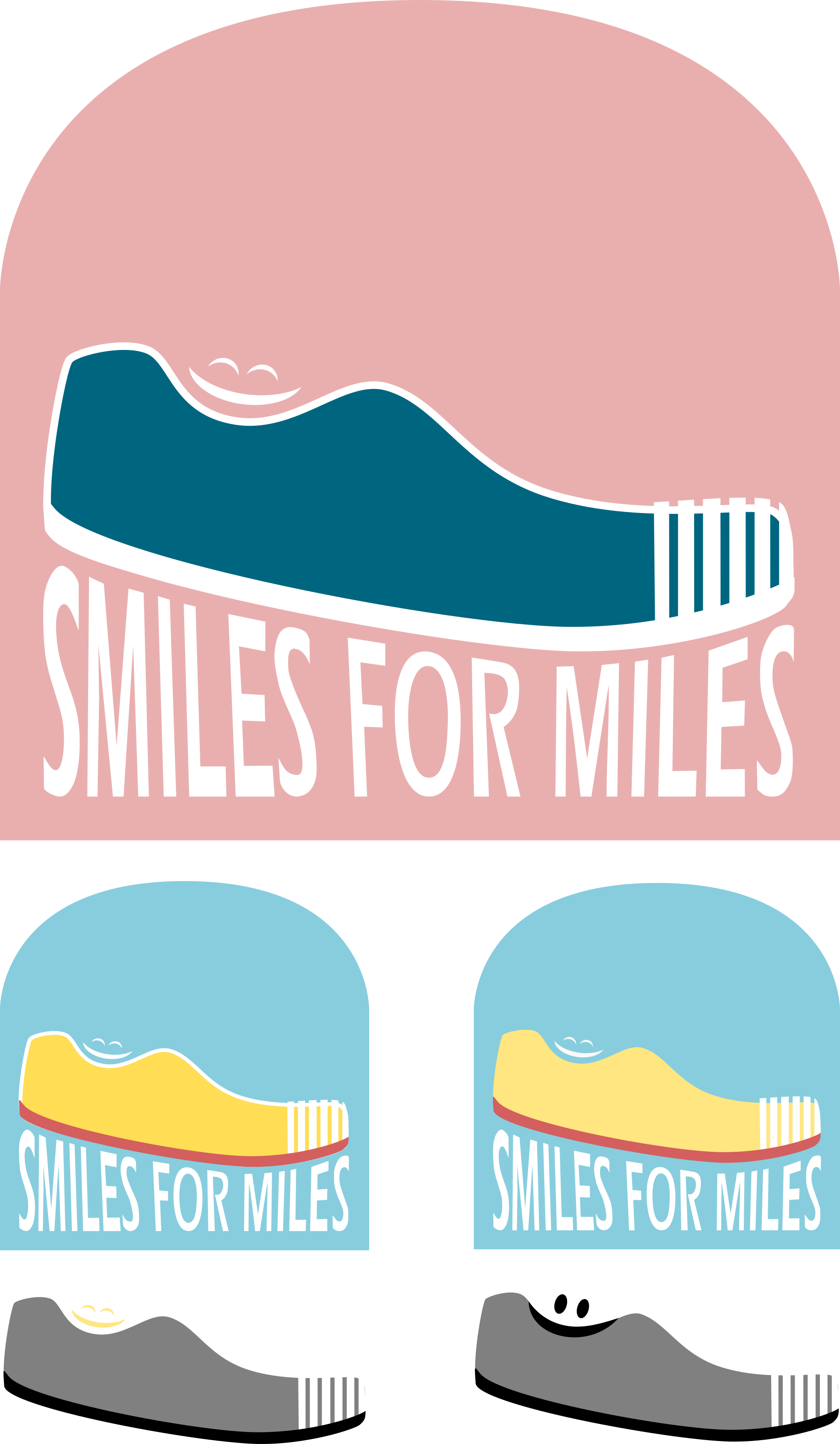
Final Presentation
Sample colors in the chosen palette at the top, plus a greyscale and deconstructed
version at the bottom. This highlights the individual elements and the strength of the logo’s shape rather than a dependance on color
If the client and I had decided on a logo, but was having trouble picking between color palettes, I would present something like this. Two options side by side to be chosen from.