
A prompt generated from Sharpen! I used different binding styles and design styles to show the “client” a few different directions we could take.
Norwegian Hot Sauce Recipe Books
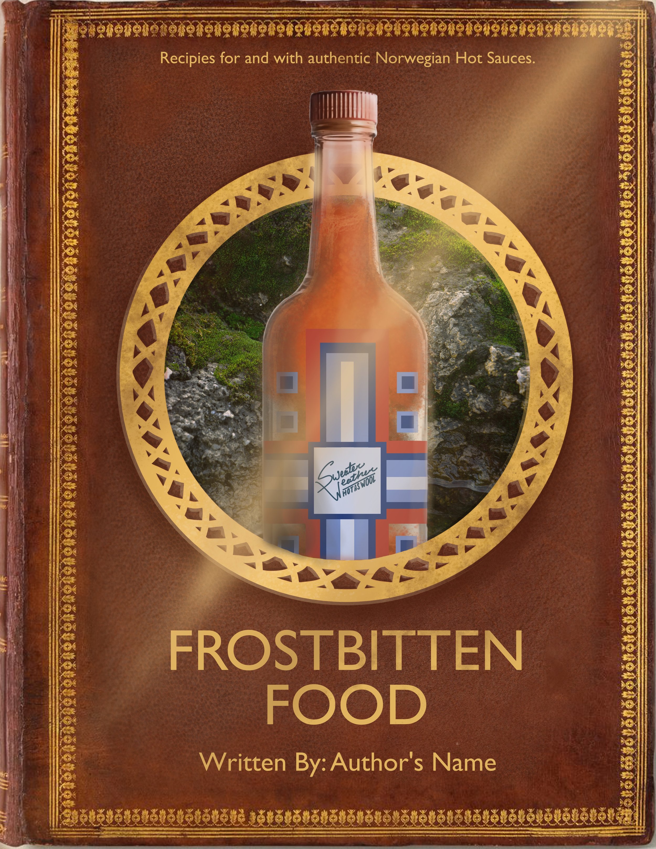
Cover 1
Ancient “journal” inspiration, with this first cover I leaned more into the traditional items associated with Norway. The Celtic pattern in the circle, the fjord-like photography in the background, and a more straight simple font. The light leak is to pull it all together and show this design could have a more glossy cover.
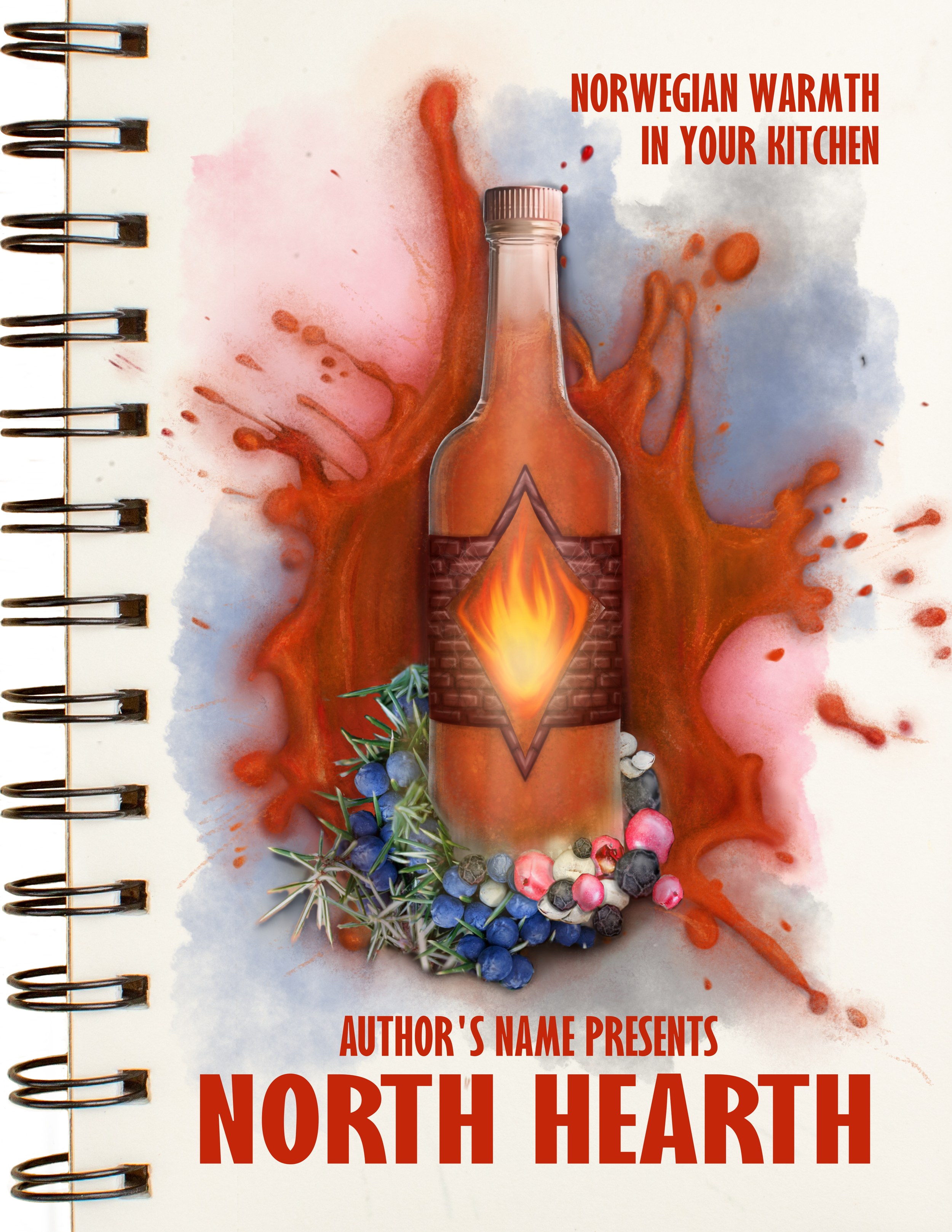
Cover 2
Drawing a little from Scandinavian minimalism in modern design, this cover is simple and straight
to the point. The difference is the lack of clean
lines because cooking is always a little messy! Peppercorns of different colors and Juniper Berries represent featured ingredients that would be in
the hot sauce. The splash of hot sauce in the back adds some motion and energy to the cover to tie
in with the kick these recipes would have. The font feels sturdy and as welcoming as a North Hearth would be.
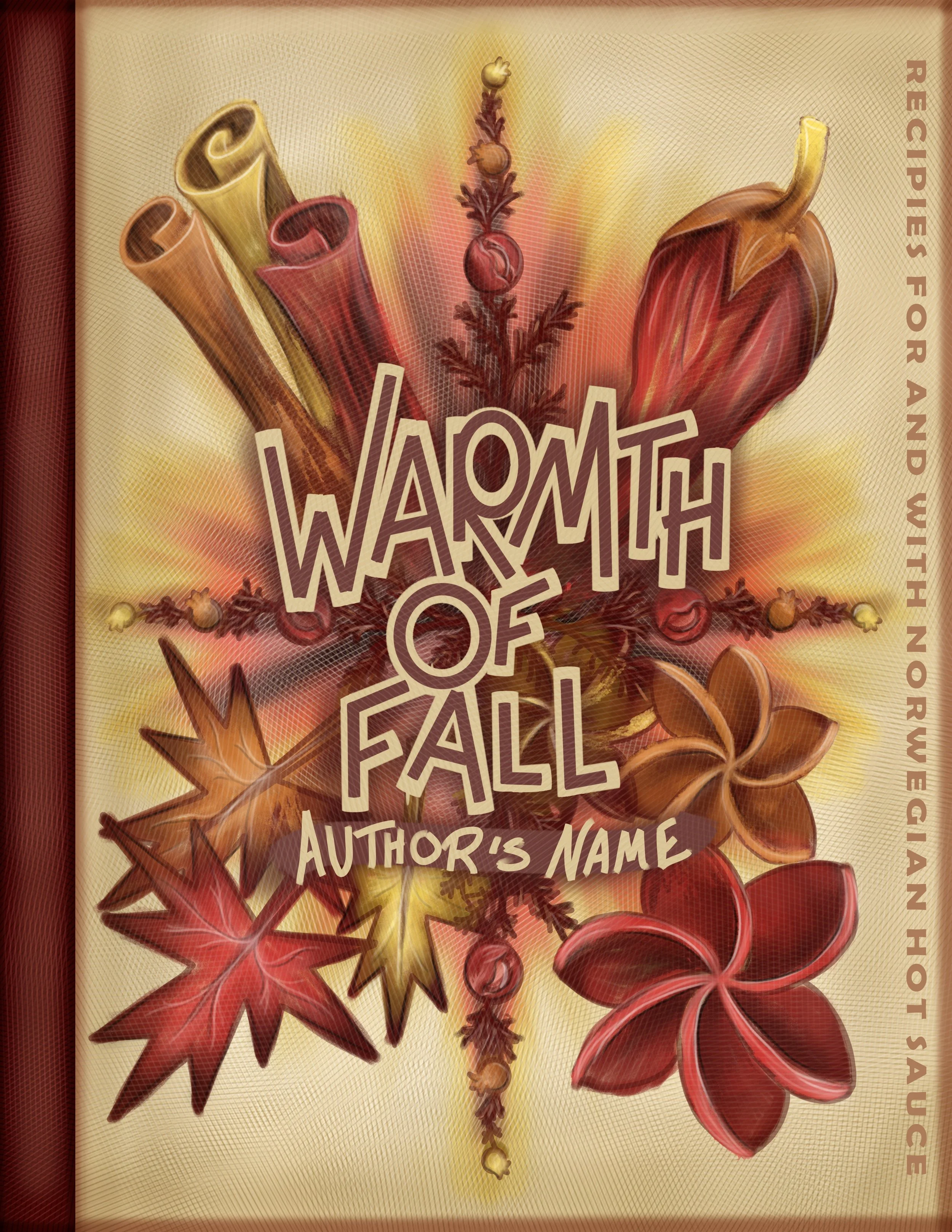
Cover 3
Taking a different approach from featuring the actual bottle of hot sauce, this design features more of the flavors in the recipes and the text of the title. The binding would be a little textured, more like a sweater would be.
The Process
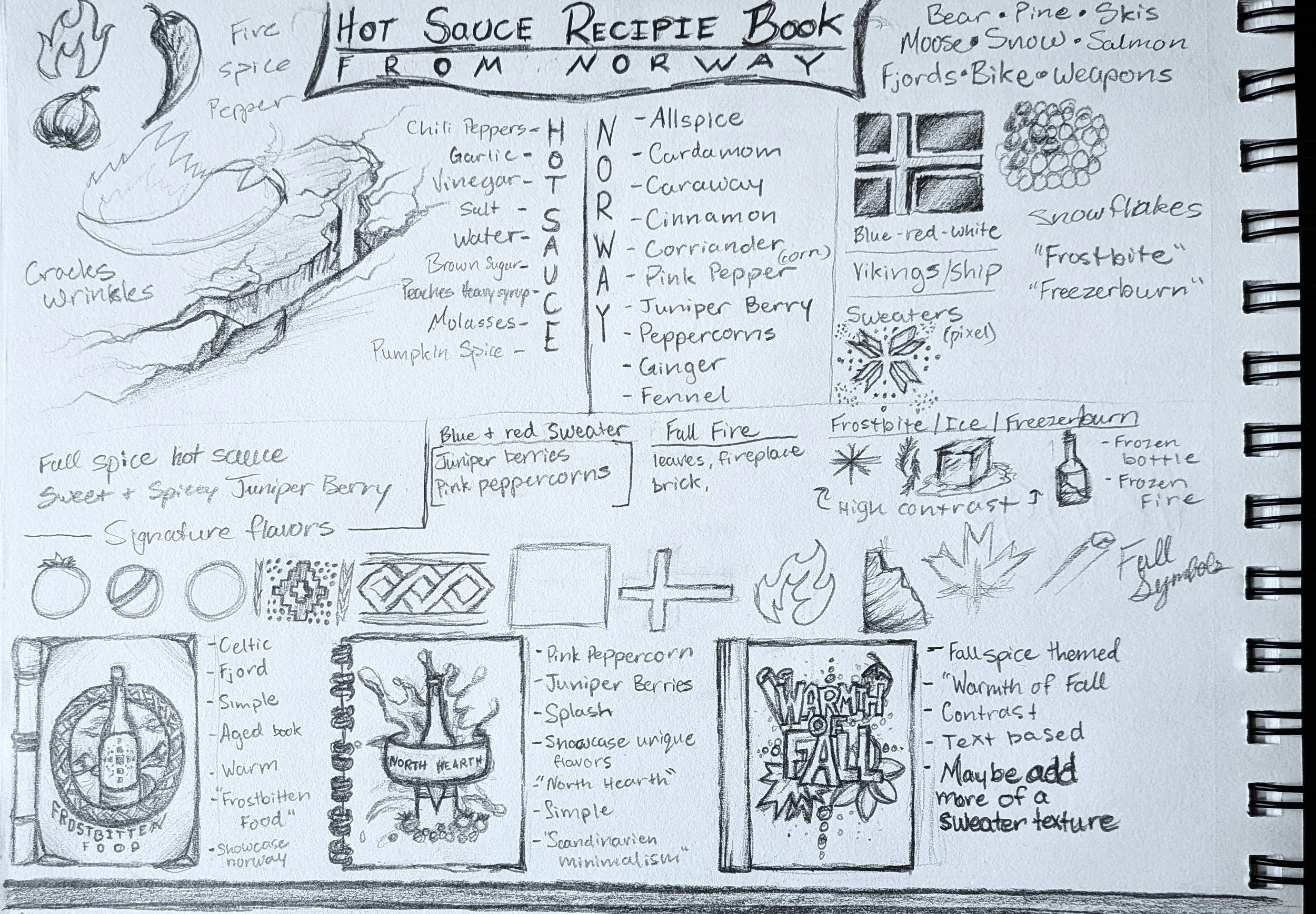
First, I started with listing some possible ingredients in hot sauce, then some typical flavors of Norway. On the left I started sketching some of the typical hot sauce symbols, and on the right some symbols of Norway.
Beneath, I started to isolate and combine some options I liked. Then, once I had a good list of elements to choose from, I could come up with a few drafts.
I tried three different book styles as my starting points. Then, I sketched on the first design I came up with when I saw each binding. Sometimes, as seen on the right side of the designs, it helps to list what originally came to mind that I would like to incorporate on that cover.
Using images from Freepik, and supplementing with my own drawings and photography, I made the three covers in Krita. I got feedback from my family and friends on what they saw and how to improve the designs. After making some alterations to all of them, what you see pictured above is the final result.