
Prompt - Wide Display Ad for the Minnesota Vikings
Growing up, I have watched a LOT of Football with my family. Every Sunday after church we would sit in the living room with snacks (and me often with a sketchbook doodling) and watch the Vikings together. So, when I got this prompt on Sharpen, I knew I just had to make it.

This is completely unofficial and in no way associated with the actual team.
I started with listing some shapes, symbols, colors, and themes associated with the Vikings.
This generates “elements” which provide a starting point for designs.
Starting Point - Elements
Colors - Purple, Gold, White
Shapes - Geometric Themes, Stars, Lines, Celtic Patterns, Circles
Symbols - Frost, Football, Horn, Drum, Ice, Snow, “Winter Warrior,” Runes, US Bank Stadium, “SKOL”
Previous Vikings Ads - Gradients, High Energy, Personalized Font
Size of Ad - “Wide Display Ad” with a 19:5 ratio.
Next Step - Sketches
I am able to brainstorm better on paper than on a computer.
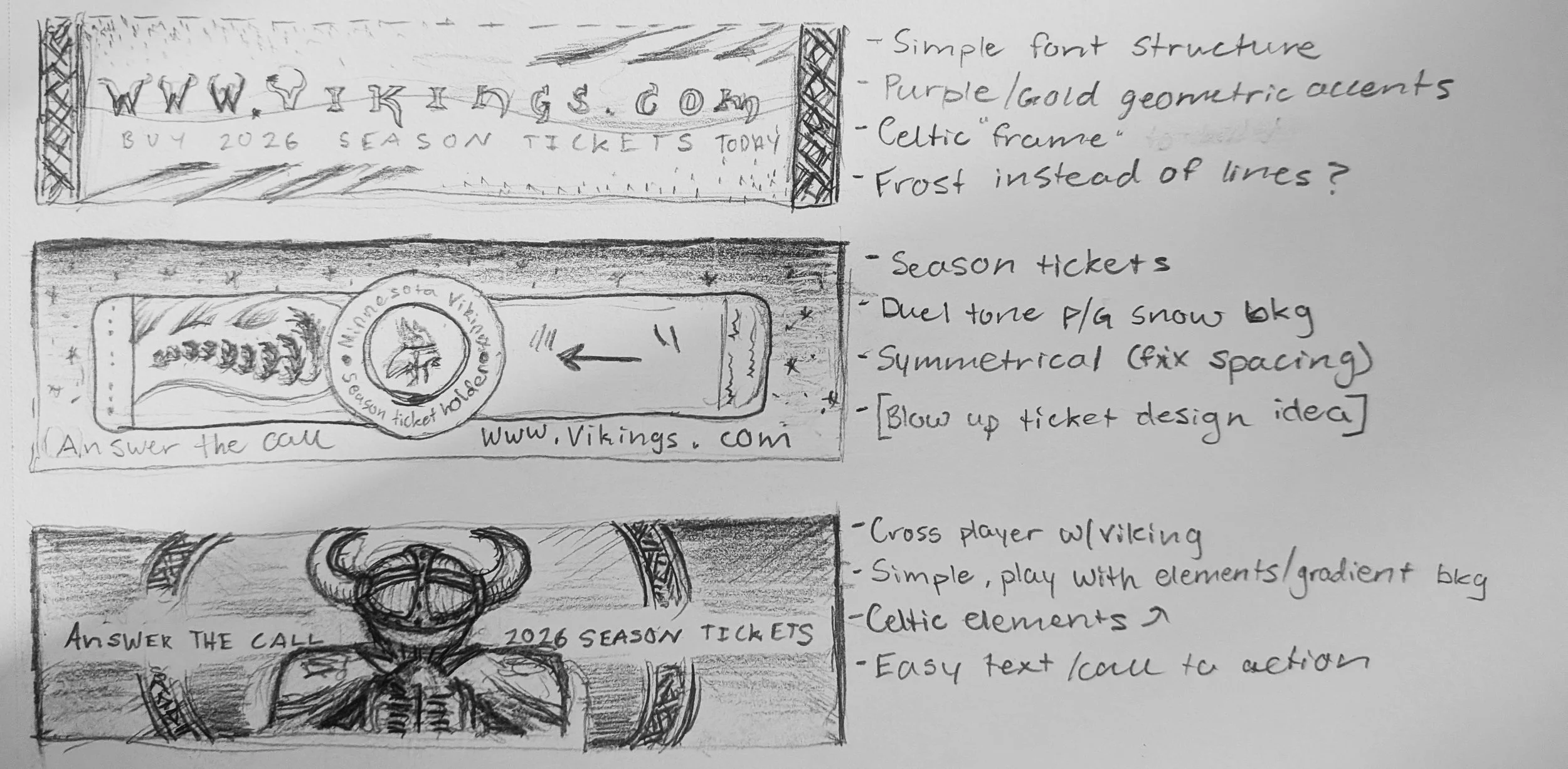
So, I took the elements listed and drew them into three prototypes for an ad.
My purpose was to sell season tickets for the next season. I wanted to keep the designs relatively simple with a clear focus. I want people who see this ad to go
to the Vikings website and purchase season tickets.
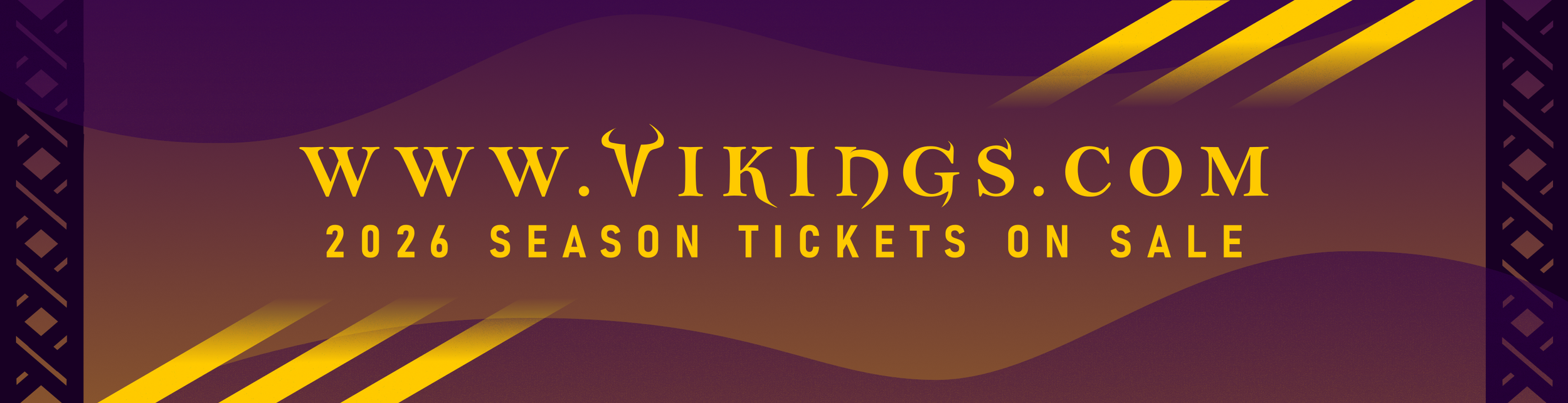
The first is just some basic geometric elements, a stylized version of the Vikings website URL, and my call to action “Buy Season Tickets.”
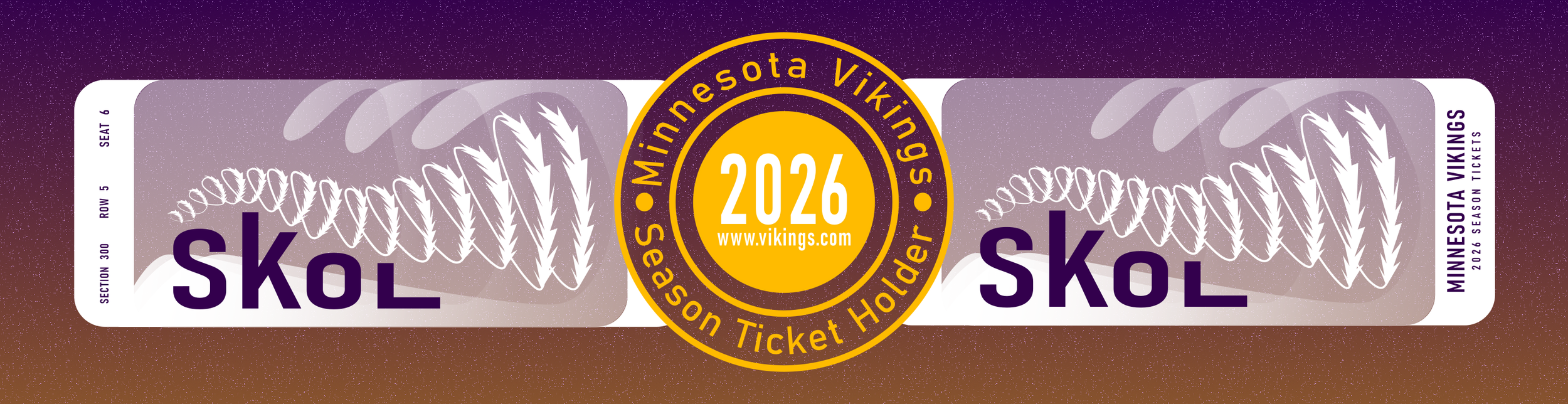
The second features the ‘season ticket holder’ mark and the actual designs of the tickets for the year. Its a little busier, but has a connection to something physical
in the digital world we live in today.
The last I wanted to take a more cinematic direction. High contrast, VERY simple message, and featuring one bold symbol in the center of the background.
Finally - Create The Ads
For these ads, I used Inkscape. Its a free software built for graphic design and with vector based graphics in mind.
The main change from my sketch in this was in the center. Originally I was going to give that information below the tickets, but the spacing wasn’t right. Instead, I added all of it to the button in the center (reminiscent of the actual season ticket holder mark). The ticket design is a nod to a sculpture that was outside the Metrodome, the Viking’s old stadium, but this is wrapped frost instead of metal.
This design stayed relatively similar to the sketch. I wanted the website URL to be the focal point and lead into the call to action. The high contrast from the background and gradient elements leading in from the corners help to achieve this. Then, there is a simple Celtic frame on the edges to tie in another element associated with the Vikings.

Finally, my favorite design. It’s bold, very high contrast, and instantly draws you eye to it. It changed a lot from my original thought as I opted for a much simpler element like the horn instead of the football player. I also added more of the Celtic pattern with slight shape and color changes to draw the viewer into the center of the ad. My call is simple and its phrasing ties in with the horn.
All three ads (especially the third) target people who are already fans of the Minnesota Vikings. People who already know and love the Vikings are much more likely to buy season tickets, so the ads can get away with a little less direct branding. The symbols and colors are enough for people who know the Vikings to deduct that these are Vikings ads. If they were to target people new to the Vikings (or less familiar with football), these ads would need to include more ties to the sport, Minnesota, and say “Vikings” on them. A viewer would need to know what sport, what team, and glean the purpose of the ad. The first two designs lean a more straightforward and informative direction like that.
All in all, this was a very fun project to work on and I really learned a lot about design and vector graphics through it.