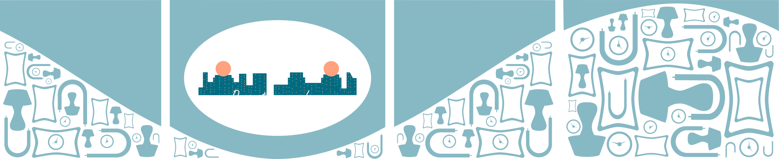
Home Decor Subscription Box
I had so much fun animating this in Blender!
Prompt: Shipping boxes for Home Decor refresh.
Modern, Urban feel
Something like Hello Fresh or Thrive Market
Colors/Icons of
my choiceLogo is a wordmark.
Scroll
for my
process!
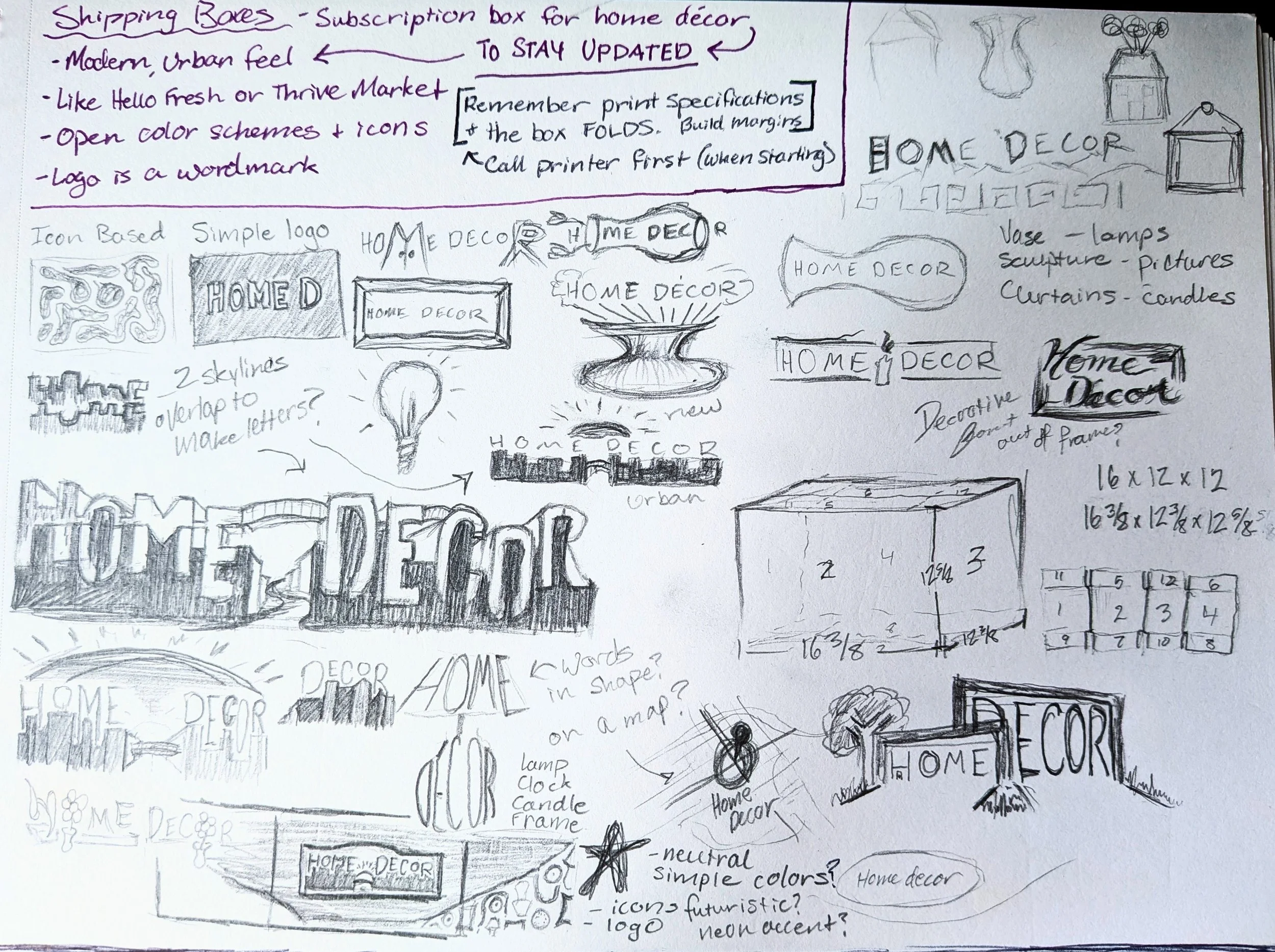
Sketch Phase!
I knew I needed to start with their wordmark and some icons to represent them. So, I wrote out “Home Decor” and sketched some simple items I think of in relation to that (lamp, little statues, frames).
Then, I leaned more into the modern, urban specification. I tried blending the name with the decor, but it wasn’t feeling quite right. So, I zoomed out to look at the city as a whole…apartments. The next thought was then blending the name and the city skyline together.
After trying some variations of that, I landed on the design at the very bottom of the page.

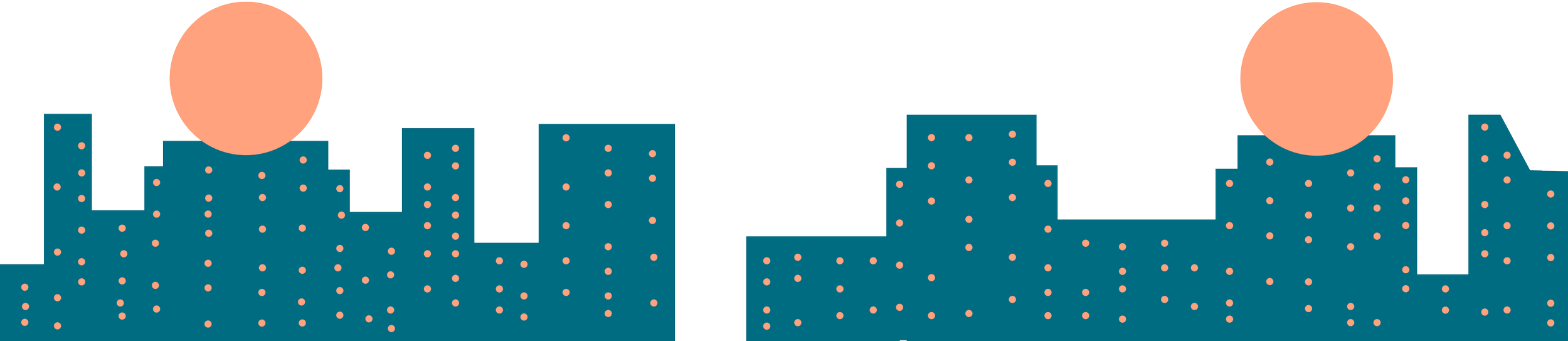
Eventually, after playing with fonts, layouts, and colors, a city started to form from the bottom of the letters. I traced it out and added some lights (though the wordmark itself would work without any colors).
Since I had stuck with “Home Decor” as a name, it left me with some O’s to play with.
To represent the constant renewal of decor, they became rising suns. That helped solidify the colors I chose.
I wanted the colors and icons to have potential for high contract and clean bold designs, showing that with them, its easy to stay up to date on the latest decor.